
Setting Up a Gallery Section
On this page
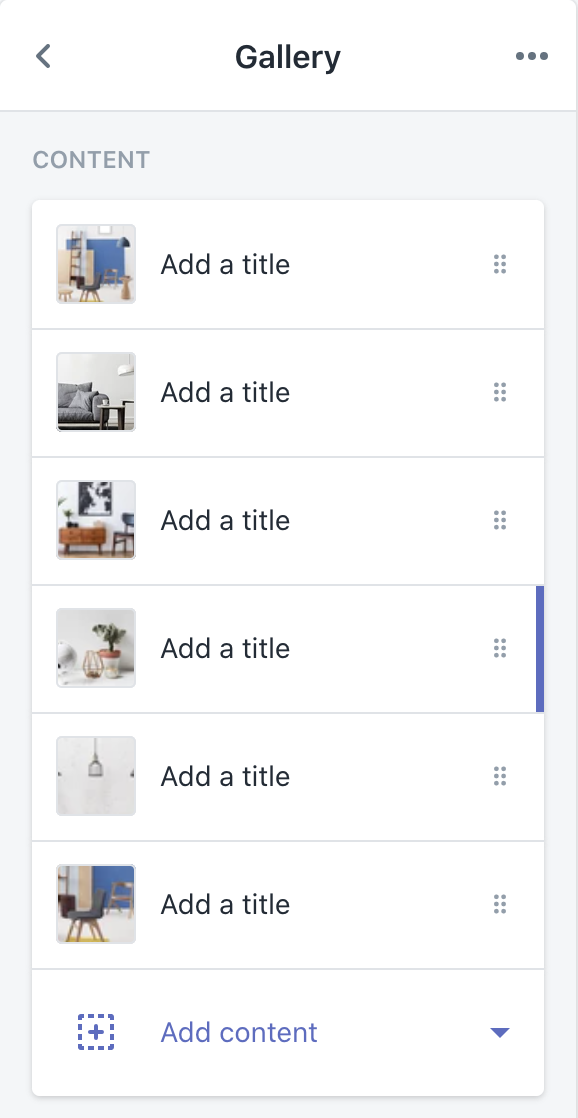
Content
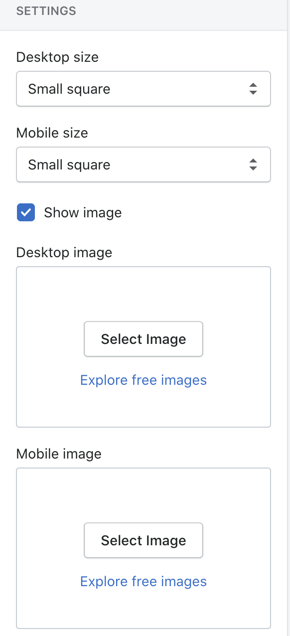
- Desktop size: Use the dropdown to select between Small square, Large square, Tall rectangle and Wide rectangle.
- Mobile size: Use the dropdown to select between Small square, Large square, Tall rectangle and Wide rectangle.
- Show image: Toggle this on or off to show or hide the image.
- Desktop image: This controls which image will display in the gallery block.
- Mobile image: This controls which image will display in the gallery block.
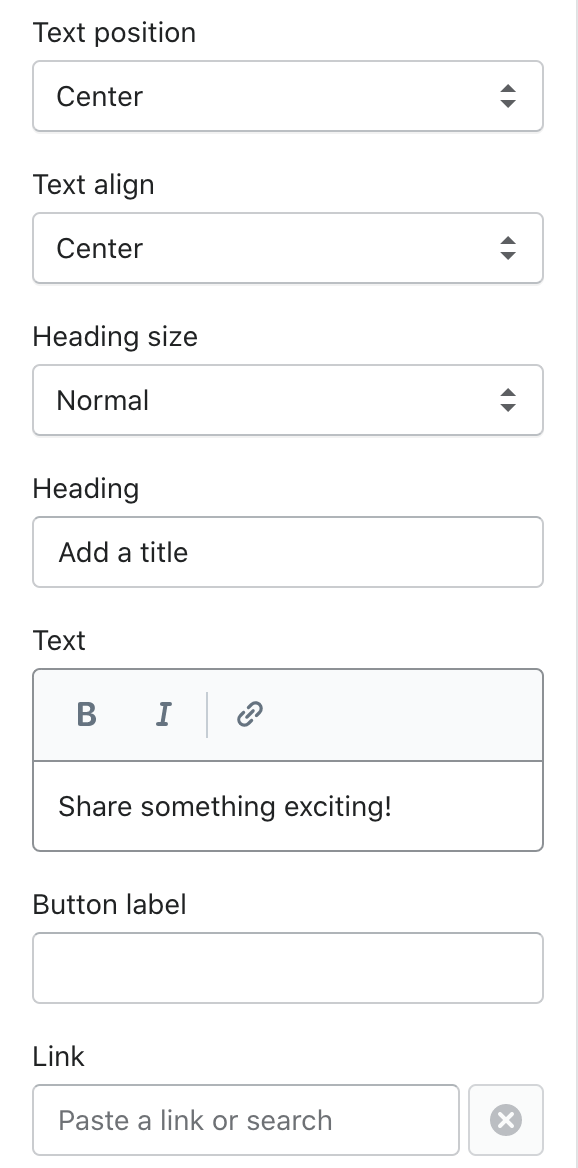
- Heading: This field updates the heading text of the gallery block.
- Text: This field updates the text in the gallery block.
- Button label: This field updates the button text in the gallery block.
- Link: Choose a link within Shopify from the pop-up menu or paste a URL in the field.
- Text position: Use the dropdown to select between Top left, Top center, Top right, Center left, Center, Center right, Bottom left, Bottom center and Bottom right.
- Text align: Use the dropdown to select between Left, Center and Right.
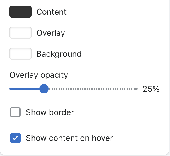
- Content: Use the color picker to change the content color of the gallery block.
- Overlay: Use the color picker to change the overlay color of the gallery block.
- Background: Use the color picker to change the background color of the gallery block.
- Overlay opacity: Use the slider to control the opacity of the overlay. The minimum value is 0, and the maximum value is 100.
- Show border: Toggle this on or off to show a border on your gallery block.
- Show content on hover: Toggle this on or off to show the content on hover only.
Gallery content can be rearranged to create dynamic layouts.
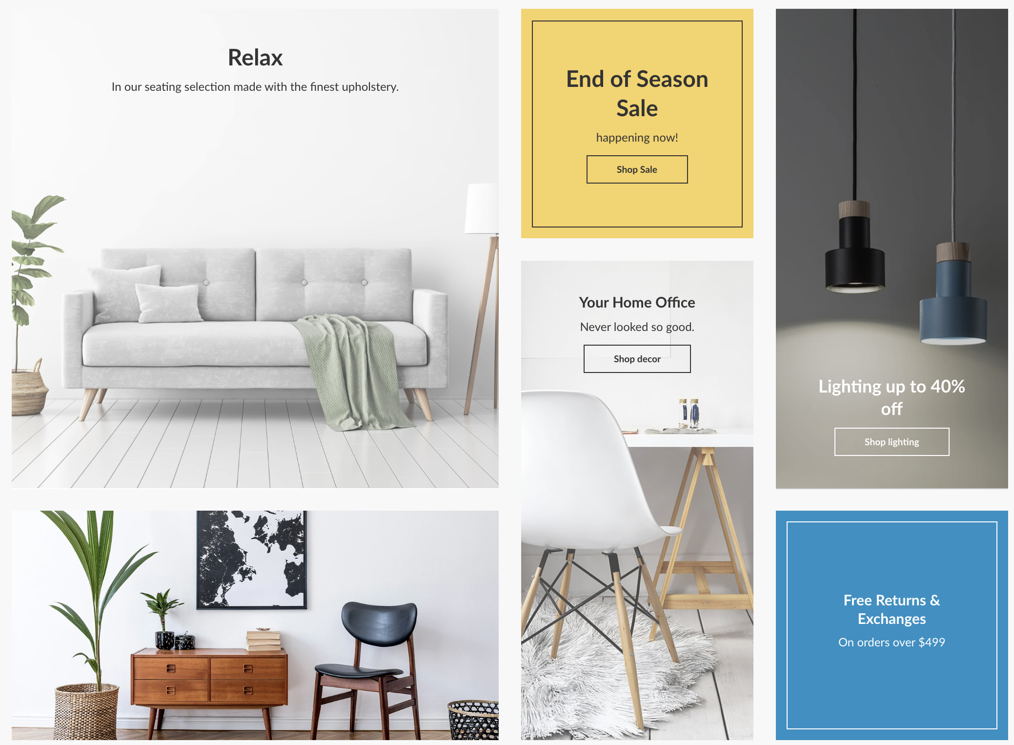
- Layout 1: Small square, Small square, Tall rectangle, Tall rectangle, Large square, Wide rectangle

- Layout 2: Large square, Small Square, Tall rectangle, Wide rectangle, Tall rectangle, Small square
- Layout 3: Wide rectangle, Small square, Tall rectangle, Tall rectangle, Large square, Small square

Tip
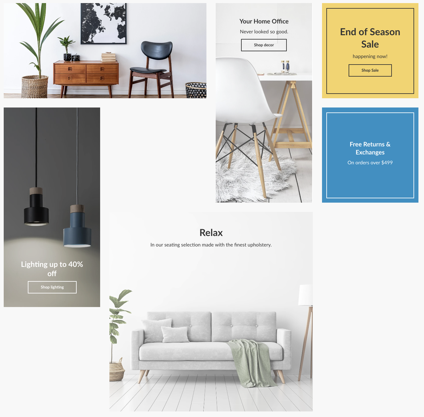
If you are experiencing odd gaps in your gallery, rearrange the content blocks so the grid fills out better. The order of the blocks goes left to right, then top to bottom.
For example, this gallery has content blocks in the order of Wide rectangle, Tall rectangle, Small square, Tall rectangle, Large square, Small square.
You can see that this arrangement causes gaps in the gallery grid. Drag and drop the gallery blocks to better fill the space.
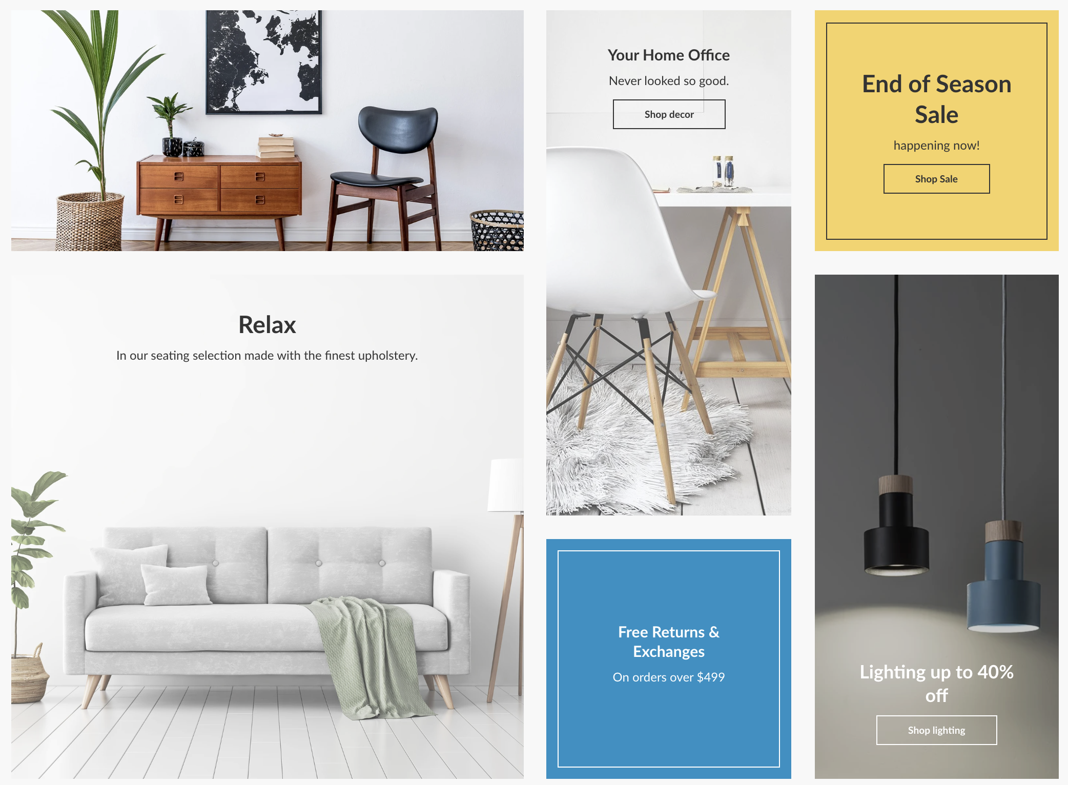
By moving the Large square above the Tall rectangle, I now have a filled out gallery grid.
Settings
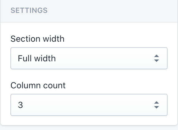
- Section width: Use the dropdown to select between Full width and Page width.
- Column count: Use the dropdown to select between 4, 3 and 2.
For additional support, please submit a request and our support team will be in touch to help!