
Featured Collection Section
On this page
General Settings
The general settings allow you to control the heading, subheading, collection, and to show a "View all" button.
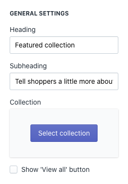
- Heading: This field updates the heading text of the Featured Collection section.
- Subheading: This field updates the subheading text of the Featured Collection section.
- Collection: This controls which collection will display in the Featured Collection section.
- Show "View all":Toggle this on or off to show the "view all products" link within the selected collection.
Note
The language "View all" is controlled in the Language Settings of your store.
Tip
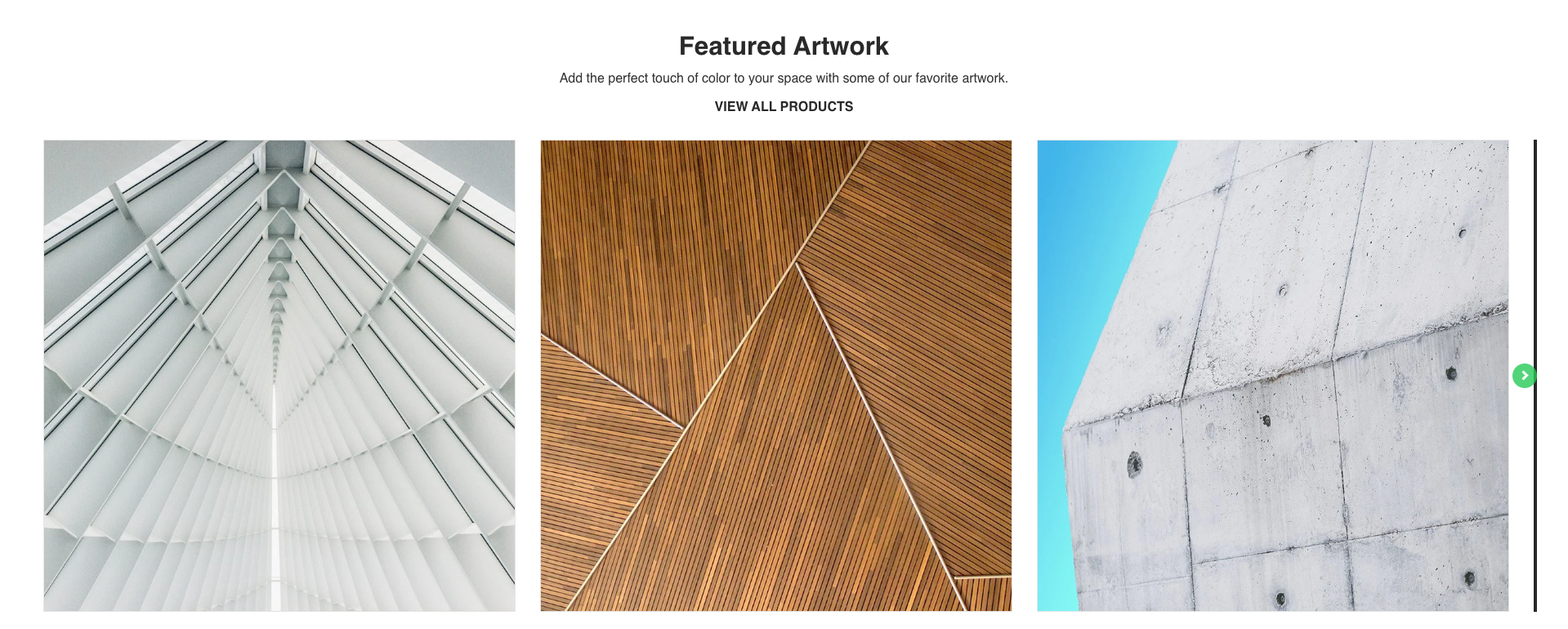
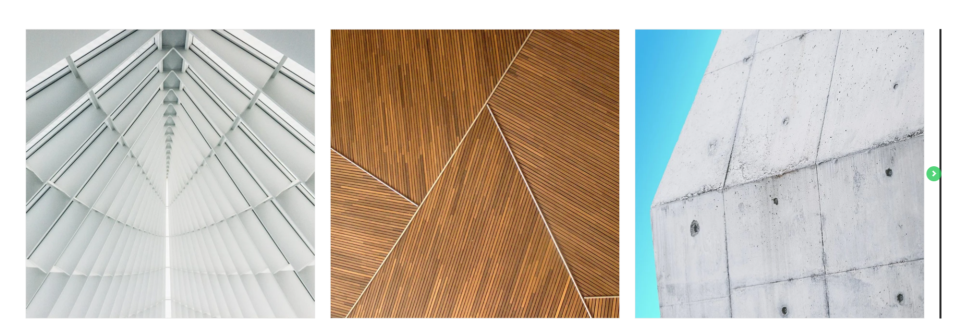
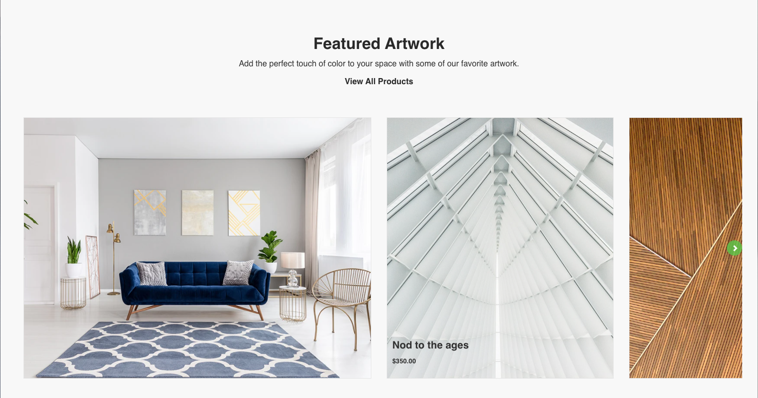
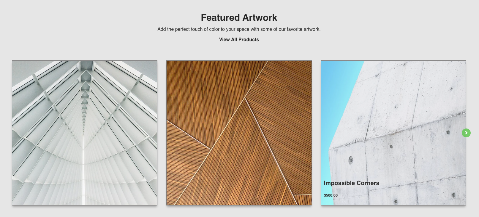
The Heading and Subheading can be left blank for a minimal aesthetic. Pictured below.
Collection Image
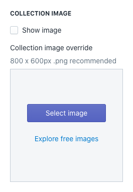
- Show image: Toggle this on or off to show the collection image.
- Collection image override: This allows you to show override a collection image with a new image.
Global Product Options
The Global Product Options gives you the ability change how the products are displayed within the section.
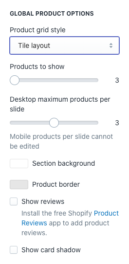
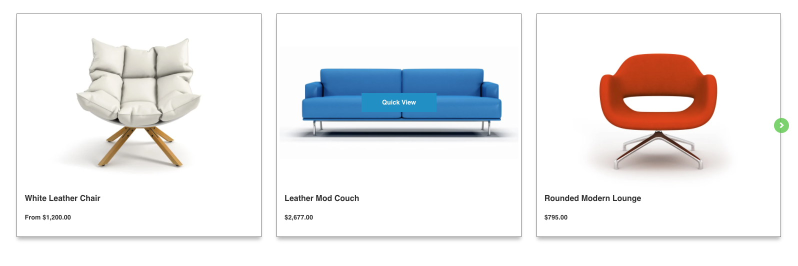
- Product grid style: This setting changes where the product information is displayed relative to the product image. Use the dropdown to select between Card layout and Tile layout.
- Card layout: Product information is displayed beneath the product image.
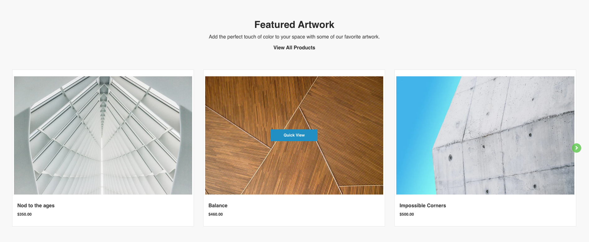
- Tile layout: Product information is overlaid on the product image.
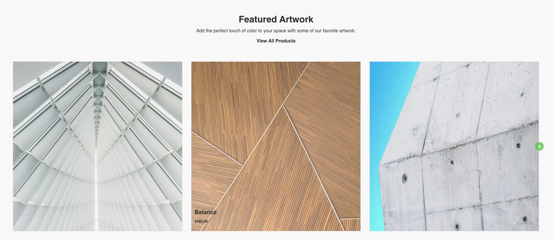
- Tile layout on mobile: When viewing the tile layout on mobile, the product information is moved below the product image.
- Card layout: Product information is displayed beneath the product image.
- Products to show: Use the slider to control how many products are displayed from the collection. The minimum value is 3, and the maximum value is 8.
- Desktop maximum products per slide: Use the slider to control the maximum number of products to show on desktop. The minimum value is 2, the maximum value is 4.
Note
Arrows will appear to the left and right of the collection carousel to allow the user to view additional products in the collection. Mobile products per slide cannot be edited.
- Section background: Use the color picker to change the background color of the section.
- Product border: Use the color picket to change the border around the products.
- Show reviews: Toggle this on or off to show Shopify Reviews on each
Note
Install the free Shopify Product Reviews app to add product views.
- Show card shadow: Toggle this on or off to show a shadow behind products.
- Featured Collection with Section background, Product border and Card shadows enabled.
- Featured Collection with Section background, Product border and Card shadows enabled.
Note
By default, there is no shadow color defined in the theme. Edit the "card shadow" color found in Theme Settings under the Body section.
Card Layout
Use these settings when you have chosen "Card layout" in the Product grid style dropdown under Global Product Options.
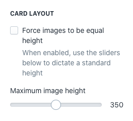
- Force images to be equal height: Toggle this on or off to force all product images to be equal height.
- Maximum image height: Use the slider to control the maximum image height.
- Force images to be equal height, unchecked
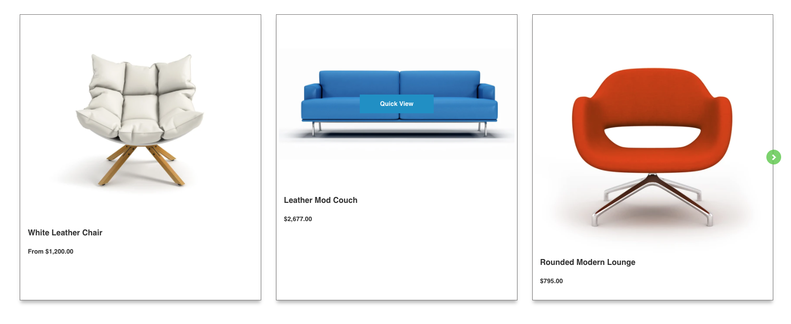
- Force images to be equal height, checked. All product images now scale proportionally to be equal height.
- Force images to be equal height, unchecked
Tip
Upload product photos that are consistent in style and aspect ratio to make sure your store looks great!
Tile Layout
Use these settings when you have chosen "Tile layout" in the Product grid style dropdown under Global Product Options.
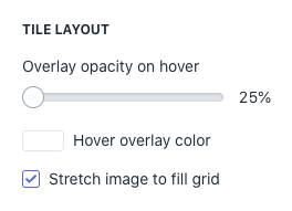
- Overlay opacity on hover: Use the slider to control the percentage of color overlay opacity when hovering over a product in desktop.
- Hover overlay color: Use the color picker to change the color overlay when hovering over a product in desktop.
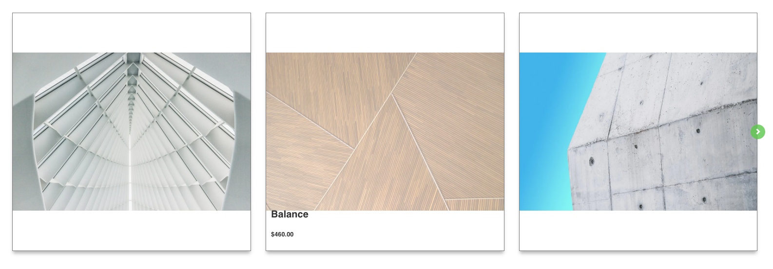
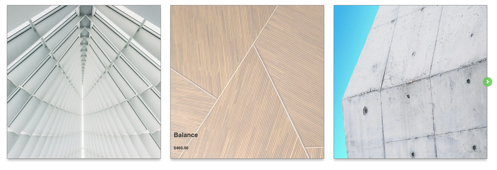
- Stretch image to fill grid: Toggle this on or off to force the product image to fill the entire grid box.
- Stretch image to fill grid, unchecked
- Stretch image to fill grid, checked
- Stretch image to fill grid, unchecked
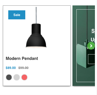
Promotion
Use these settings to control the Promotion card in the product slider.
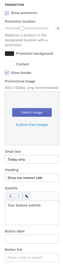
- Show promotion: Toggle this on or off to show the promotion tile in the Featured Collection slider.
- Promotion location: Use the slider to control the position of the promotion tile within the product slider.
- Promotion background: Use the color picker to change the background color of the promotion tile.
- Content: Use the color picker to change the text, button, and border color in the promotion tile.
- Show border: Toggle this on or off to show an inset border on the promotion tile.
- Promotional image: Select an image to display instead of a background color.
- Small text: This field updates thetop level text in your promotion.
- Heading: This field updates the title of your promotion.
- Subtitle: This field updates the subtitle of your promotion.
- Button label: This field updates the button text in your promotion tile.
- Button link: This field updates the button's URL in your promotion tile.
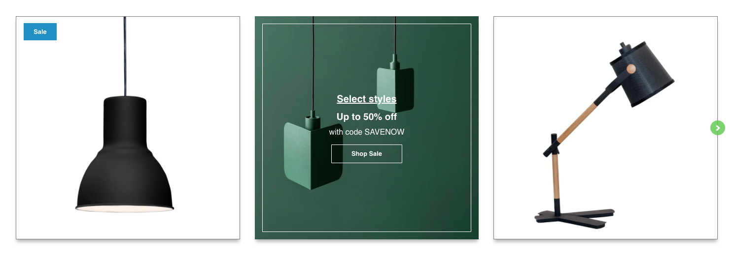
Promotional Tile in the 2nd position with a background color.
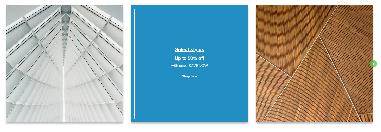
Promotional Tile in the 2nd position with a background.
Tip
Use the Small text field as a callout to grab your customer's attention!
For additional support, please submit a request and our support team will be in touch to help!