
Setting Up Your Footer
On this page
- Payment icons
- Language selector
- Currency selector
- Newsletter Content Block
- Logo Content Block
- Navigation Content Block
Settings
The settings for the footer allow you to control the visibility of payment icons, language selector and currency selector.

Payment Icons
This selector allows you to show your store's accepted forms of payments.

To remove the payment icons, simply uncheck the box.
Language Selector
This selector allows you to show a language selector in your footer. This setting allows your customer's to choose which language they view their store.
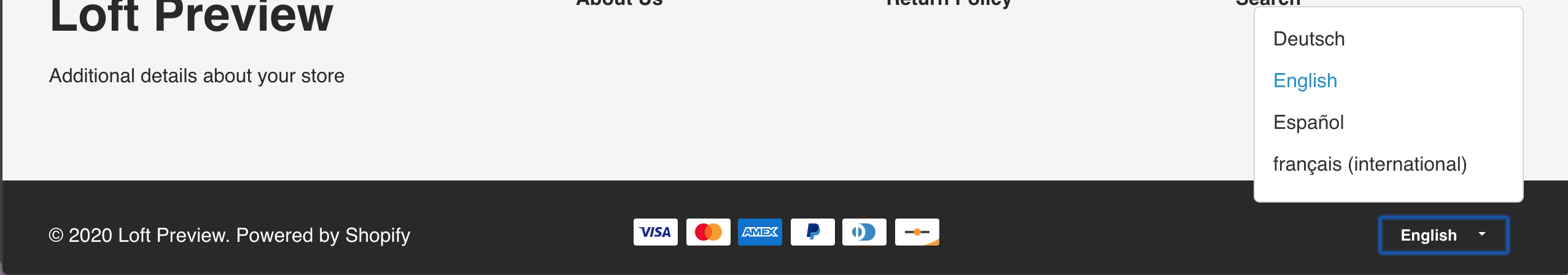
To remove the language selector, simply uncheck the box.
Currency Selector
Similar to the language selector, this selector allows you to offer various currencies on your store.
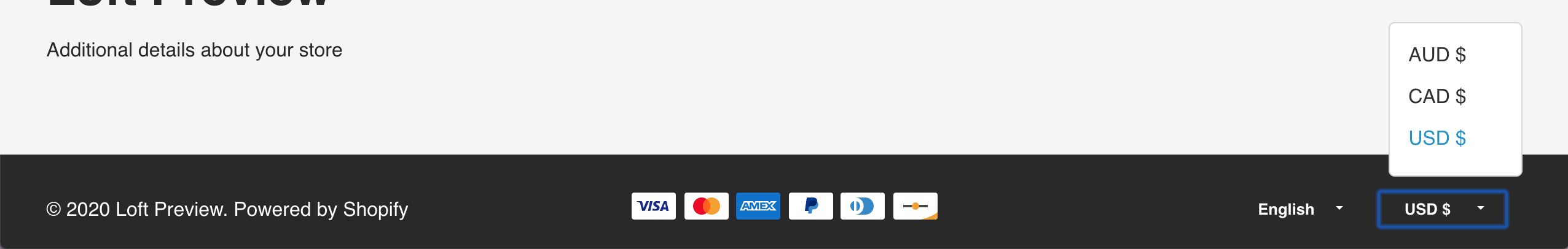
To remove the payment icons, simply uncheck the box.
Tip
To set up multiple languages and multiple currencies on your store, be sure to check out the Shopify documentation.
Selling in multiple languages
Enabling your store to sell in multiple currencies
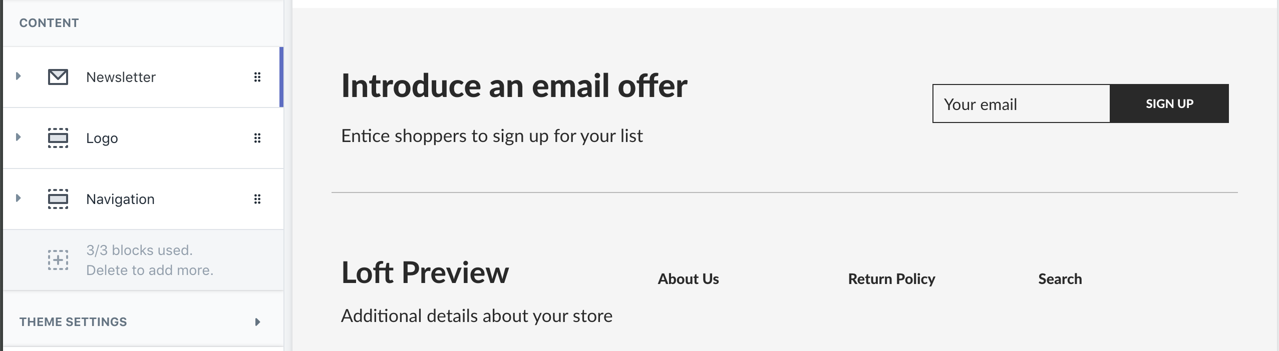
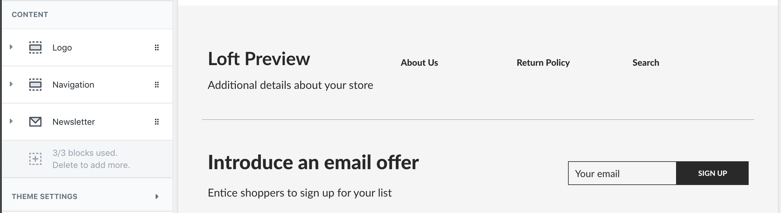
Content
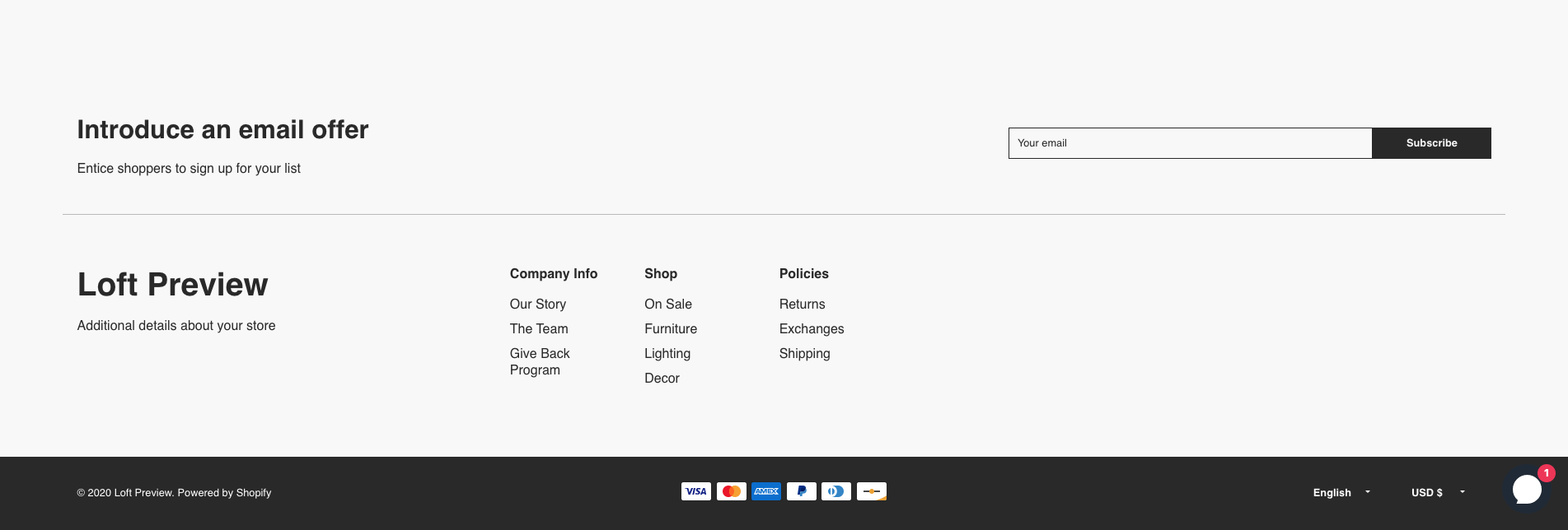
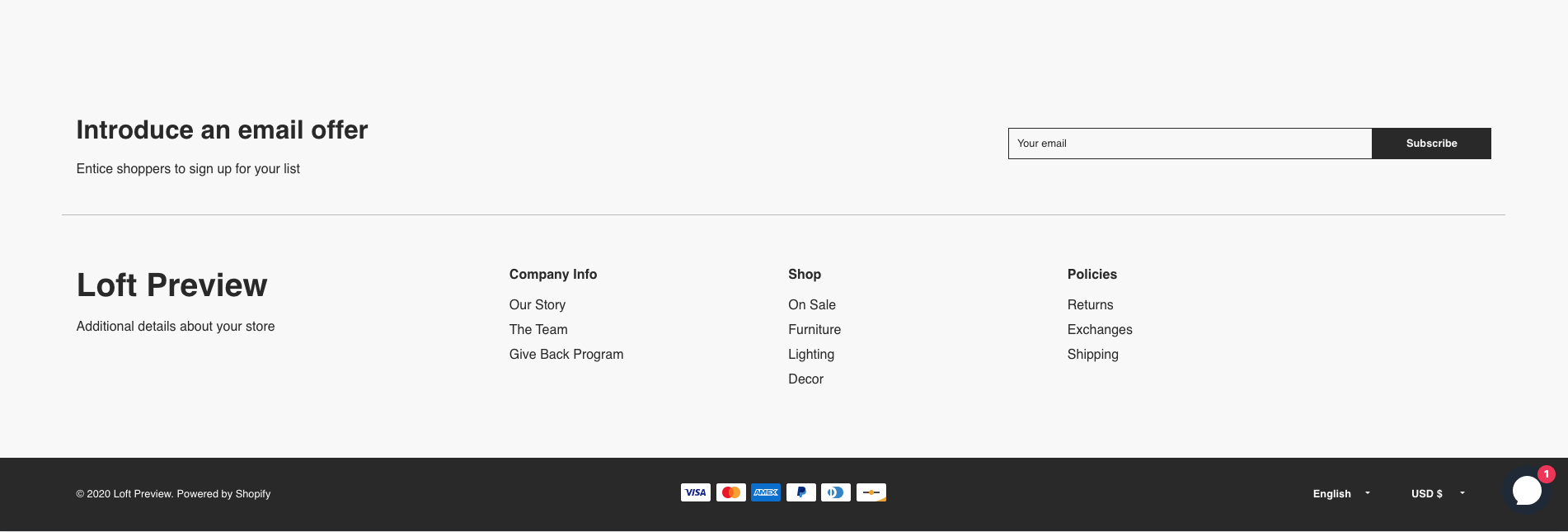
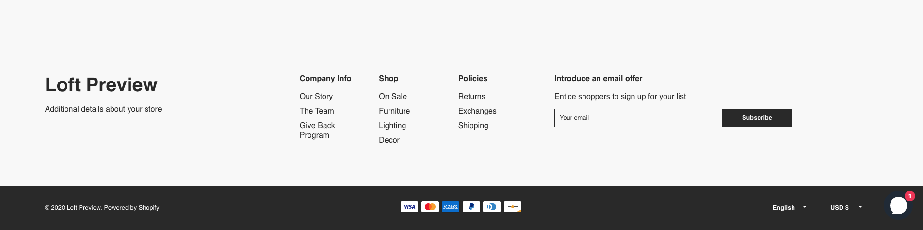
The Loft footer allows you to add up to 3 content blocks to your footer, 1 logo block, 1 newsletter block and 1 navigation block.

Newsletter Block
The newsletter block allows you to collect emails from your customers. These customers and their email address will be added to your Shopify Customers.

- Full width: Toggle this on or off to show your newsletter full width across your page. This will place the newsletter sign up either above or below the logo and navigation blocks. To view it above the other blocks, be sure it is in the first content block in the list. To view it below the other blocks, drag and drop the block below the other two.
- Above the other content blocks
- Below the other content blocks
- Heading: The title of your newsletter block.
- Description: The description of your newsletter block. You can use the rich text editor controls (bold italic, link) to further style your description text.
- Bold headings: Toggle this on or off If you want your heading to be bold. This only applies when this section is not full width.
Logo Block
The logo block allows you to either choose a logo image file to display.
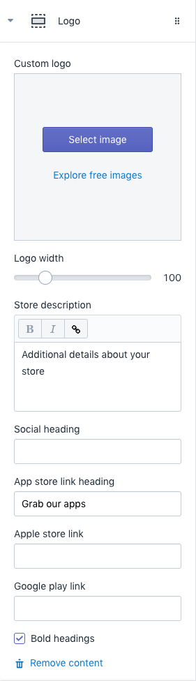
- Custom logo: Display an image instead of the store name.
- Logo width: Use the slider to change the width of your logo.
- Store description: The description of your store. You can use the rich text editor controls (bold italic, link) to further style your description text.
- Social heading: The heading for your social icons.
- App store link heading: The heading for your app store links. This will only display if a URL is entered for either the Apple store link or the Google play link.
- Apple store link: Enter the URL link to your Apple store app. This will then display the "Download on the App Store" badge for the Apple store.
- Google play link: Enter the URL link to your Google store app. This will then display the "Get it on Google Play" badge for the Google store.
- Bold headings: Toggle this on or off if you want your headings to be bold.
Tip
To show your social icons, go to the Theme Settings tab inside the Theme Editor. Then find the section called "Social media." Enter in the URL for your social profile and the icon will now automatically populate in the social icon section of the footer.
Navigation Block
The navigation block allows you to choose the menu to display in the footer and control the width of the block.

- Block width: Choose, 30%, 60% or 100% from the dropdown. This will change how much horizontal width the navigation block fills. If you choose 100%, it will move the other content blocks in use accordingly.
- Full width newsletter with 30% navigation block width. The logo and navigation block sit on the same row. The navigation block takes up30% of the row.
- Full width newsletter with 60% navigation block width. The logo and navigation block sit on the same row. The navigation block takes up60% of the row.
- 30% navigation block width without a full width newsletter. Now all 3 blocks utilize 30% of the footer width.
- Full width newsletter with 30% navigation block width. The logo and navigation block sit on the same row. The navigation block takes up30% of the row.
- Footer menu: This controls which navigation menu will display in the Footer section.
- Bold headings: Toggle this on or off if you want your navigation menu headings to be bold.
To learn more about some ideal use cases for the Loft Footer, check out our blog on this topic.
For additional support, please submit a request and our support team will be in touch to help!