
Setting Up a Slideshow Section
On this page
Content
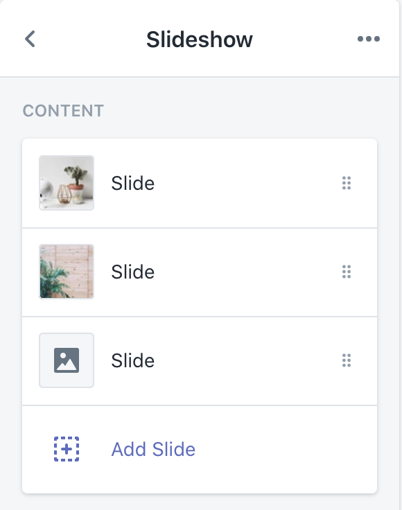
- Slide: Click to expand the slide settings.
- Add slide: Click to add another slide to your slideshow.

- Desktop image: This controls which image will display on the desktop view of your slide.
- Mobile image: This controls which image will display on the mobile view of your slide. If no mobile image is selected, then the desktop image will be used and cropped to the center.
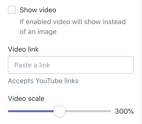
- Show video: Toggle this on or off to show the video provided in the Video link field instead of the chosen image.
- Video link: Enter the video URL you would like to use in this field.
- Video scale: Use the slider to control the scale of the video. The minimum value is 100%, and the maximum value is 500%.
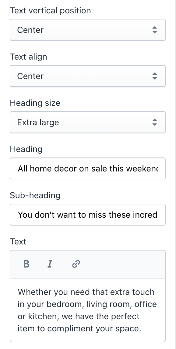
- Text vertical position: Use the dropdown to select between Top left, Top center, Top right, Center left, Center, Center right, Bottom left, Bottom center and Bottom right.
- Text align: Use the dropdown to select between Left, Center and Right.
-
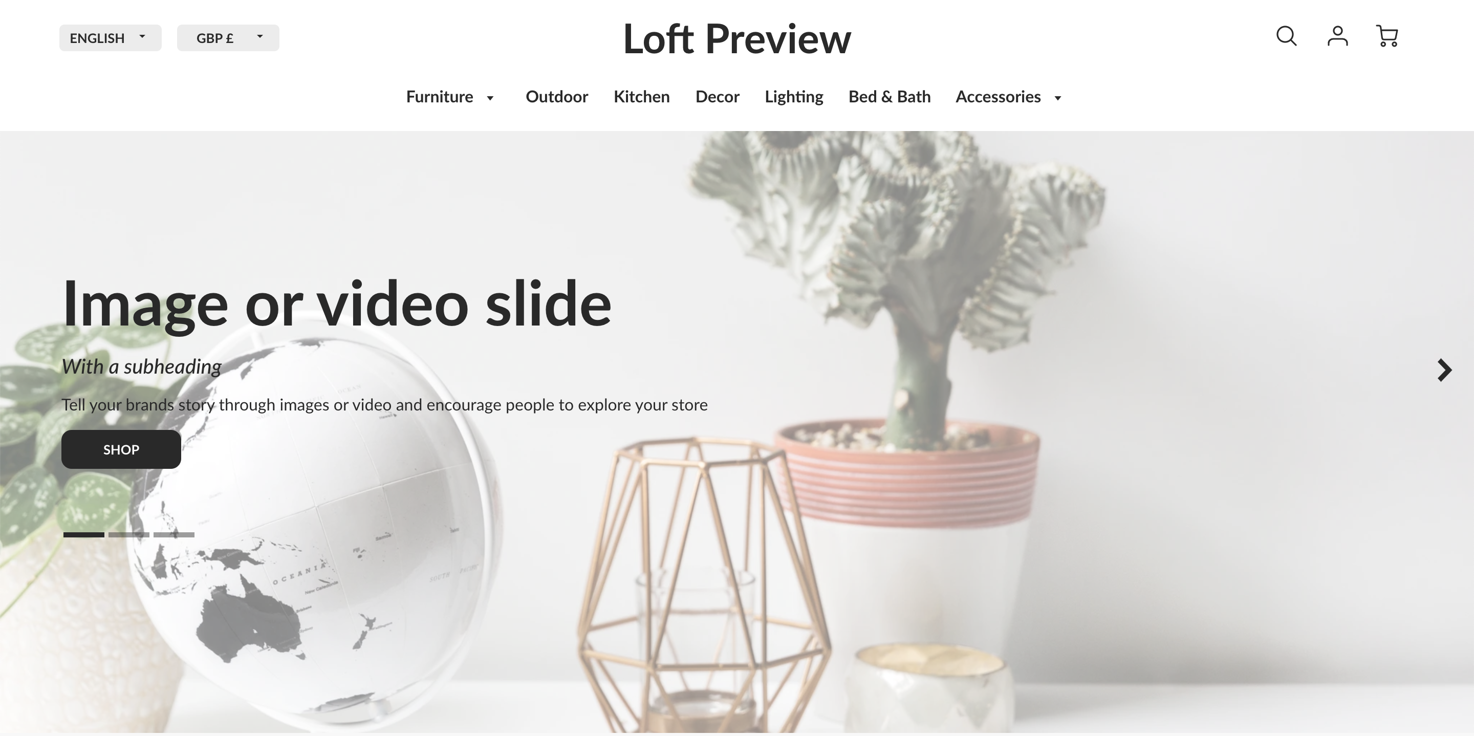
- Top left vertical position, left text align
- Top left vertical position, left text align
-
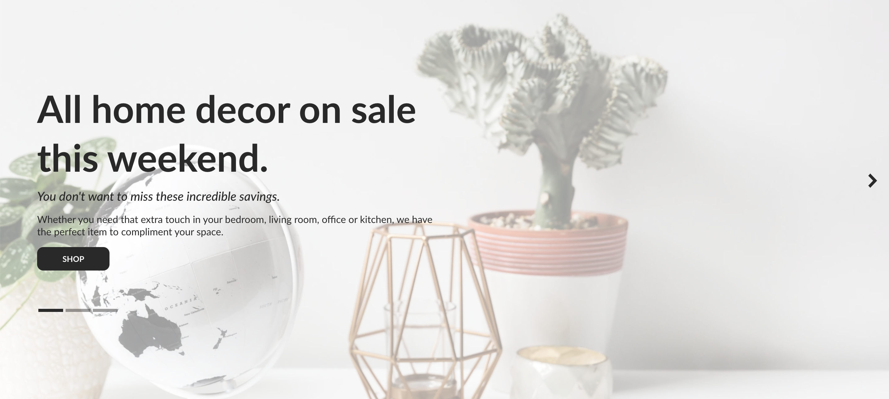
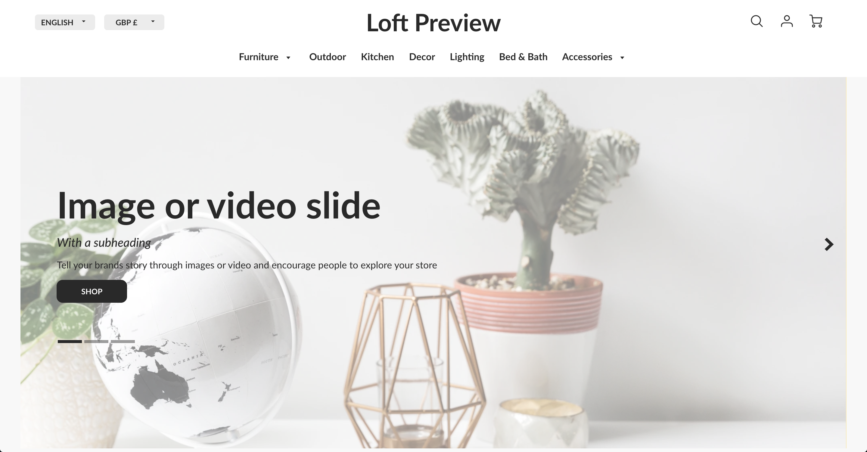
- Center vertical position, center text align
- Center vertical position, center text align
-
- Bottom right vertical position, right text align

- Bottom right vertical position, right text align
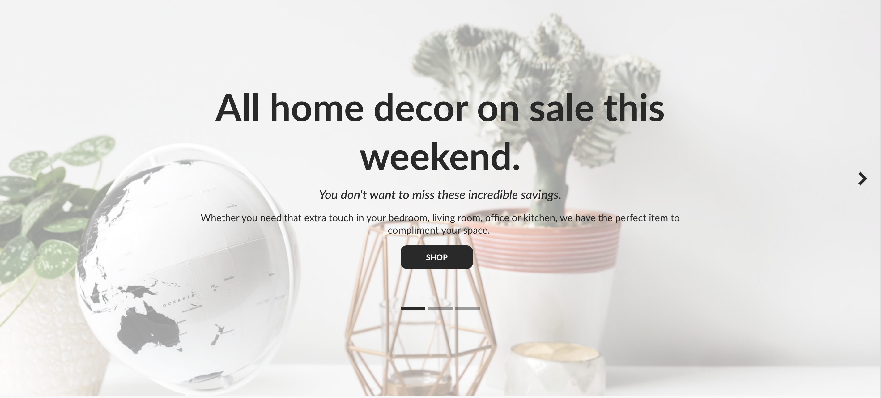
- Heading size: Use the dropdown to select between Normal, Large and Extra large.
- Heading: This field updates the heading text of the Slide.
- Sub-heading: This field updates the sub-heading text of the slide.
- Text: This field updates the text of the slide.
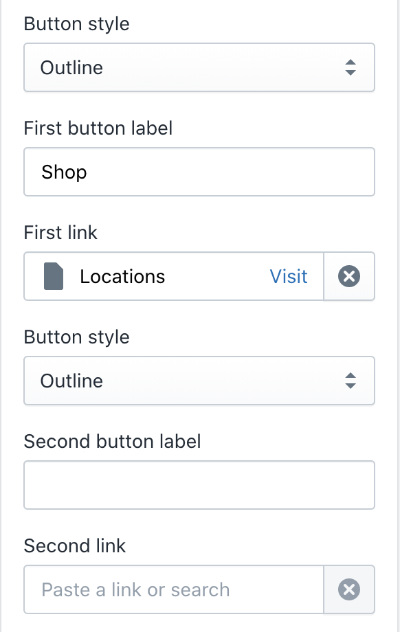
- Button style: Use the dropdown to select between Outline and Solid.
- First button label: This field updates the button text of the first button on the slide.
- First link: Choose a link within Shopify from the pop-up menu or paste a URL in the field.
- Button style: Use the dropdown to select between Outline and Solid.
- Second button label: This field updates the button text of the second button on the slide.
- Second link: Choose a link within Shopify from the pop-up menu or paste a URL in the field.
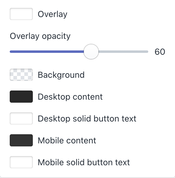
- Overlay: Use the color picker to change the overlay color of the slide.
- Overlay opacity: Use the slider to control the opacity of the overlay. The minimum value is 0, and the maximum value is 100.
- Background: Use the color picker to change the background color of the content. This only applies when the content is not set to Overlay.
- Desktop content: Use the color picker to change the content color of the slide on desktop.
- Desktop solid button text: Use the color picker to change the text color of a solid style button on desktop.
- Mobile content: Use the color picker to change the content color of the slide on mobile.
- Mobile solid button text: Use the color picker to change the text color of a solid style button on mobile.
Settings
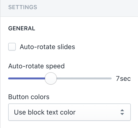
- Auto-rotate slides: Toggle this on or off to automatically advance through slides.
- Auto-rotate speed: Use the slider to control the duration of each slide. The minimum value is 5 seconds, and the maximum value is 10 seconds.
- Button colors: Use the dropdown to select between Use theme settings and Use block text color.
Layout

- Section width: Use the dropdown to select between Full width and Page width.
-
- Full width slideshow will go to the edge of the browser window.
- Full width slideshow will go to the edge of the browser window.
-
- Page width slideshow will be inset to show the margin on the left and right.
- Page width slideshow will be inset to show the margin on the left and right.
- Slide height: Use the dropdown to select between Adapt to first image, Small, Medium and Large.
- Desktop layout: Use the dropdown to select between Overlay, Text above, Text below, Text on left of image and Text on right of image.
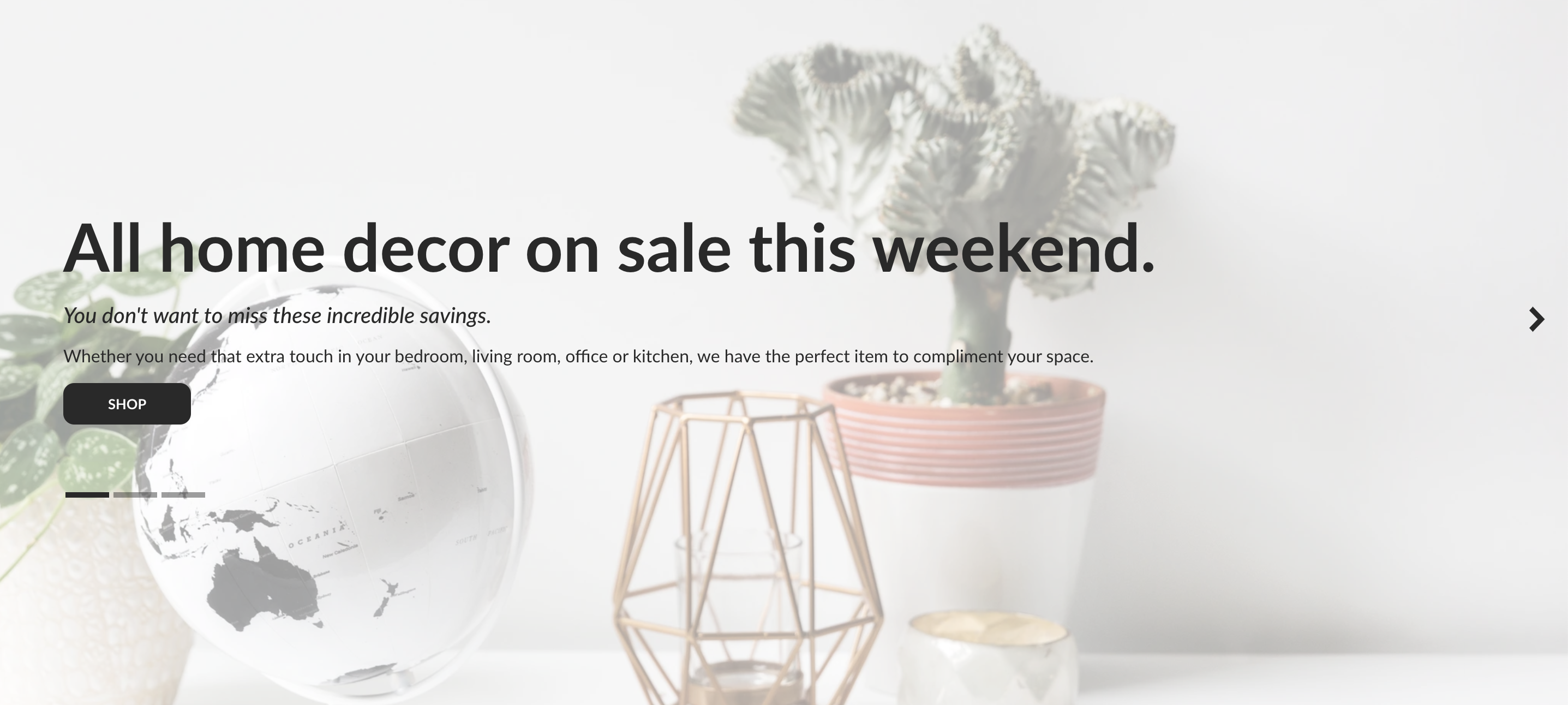
-
- Overlay text
- Overlay text
-
- Text above
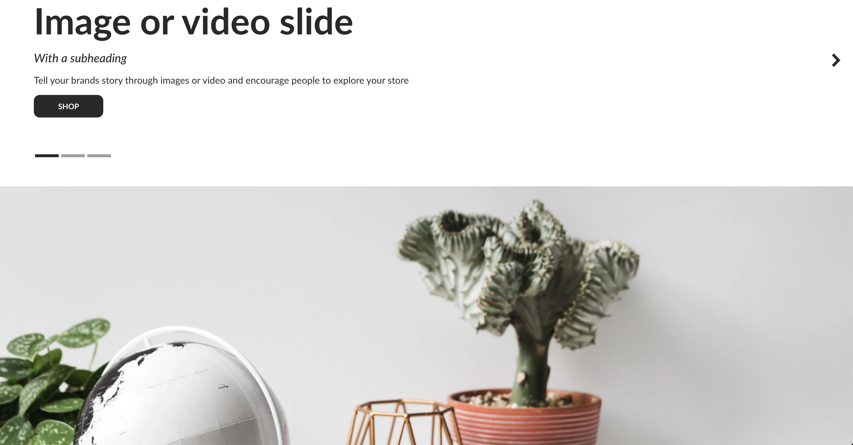
- Text above
-
- Text below
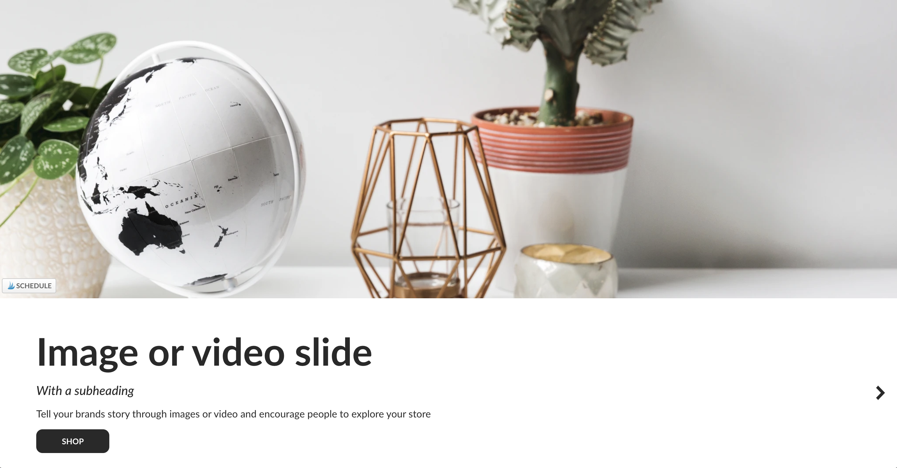
- Text below
-
- Text on the left of the image
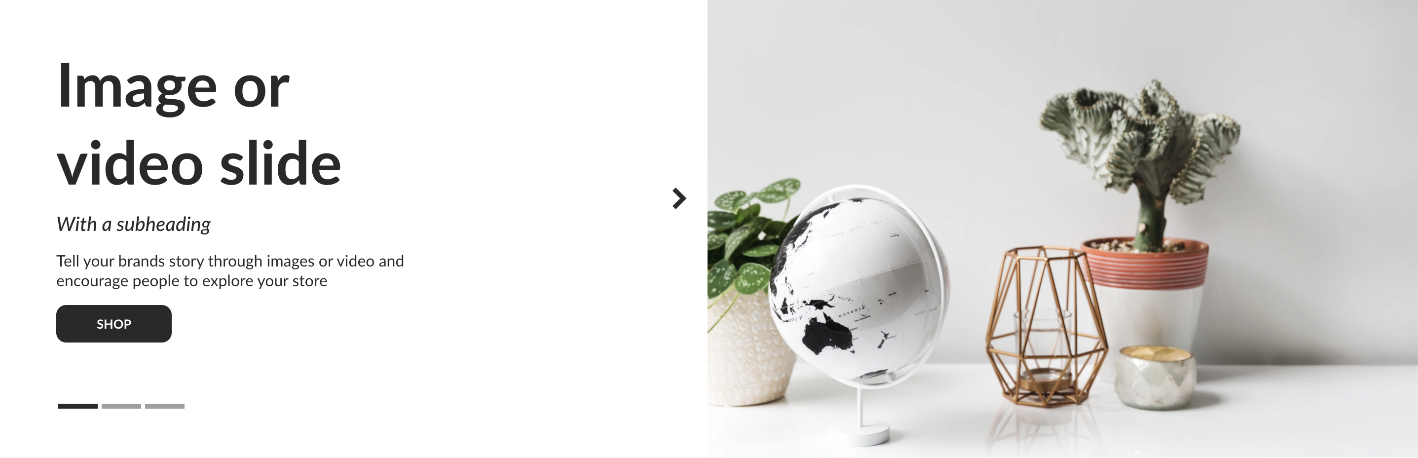
- Text on the left of the image
-
- Text on the right of the image
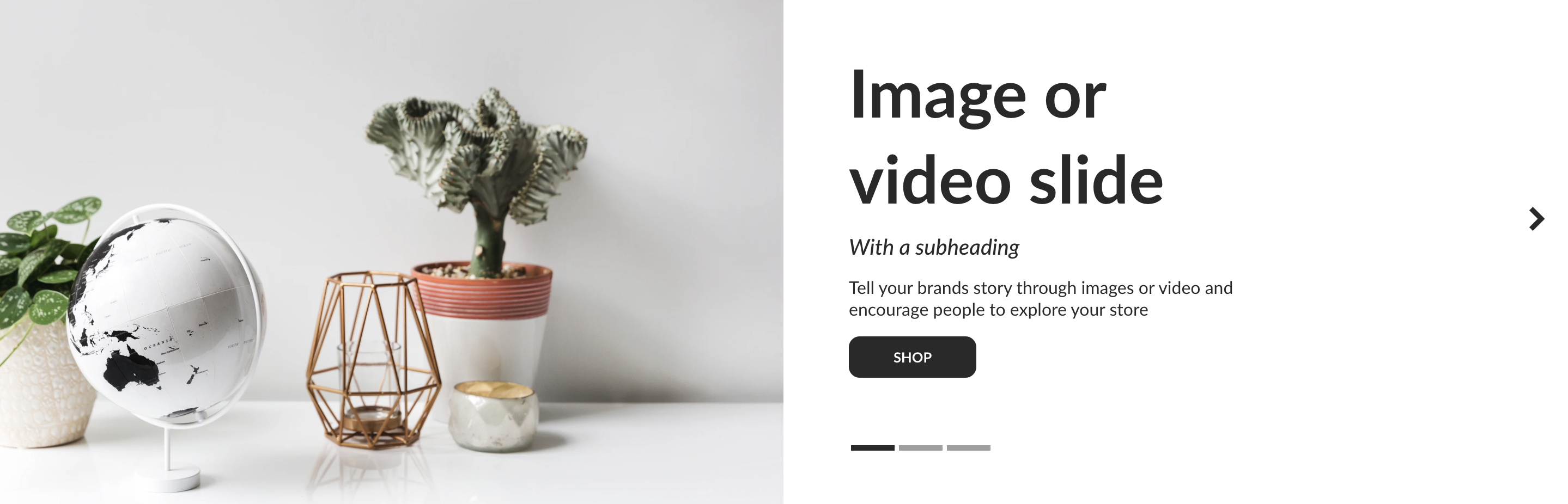
- Text on the right of the image
- Desktop slide width: Use the slider to control how wide the slide is. The minimum value is 40%, and the maximum value is 100%.
-
- When the slide width is less than 100%, then you will see a portion of the next slide.
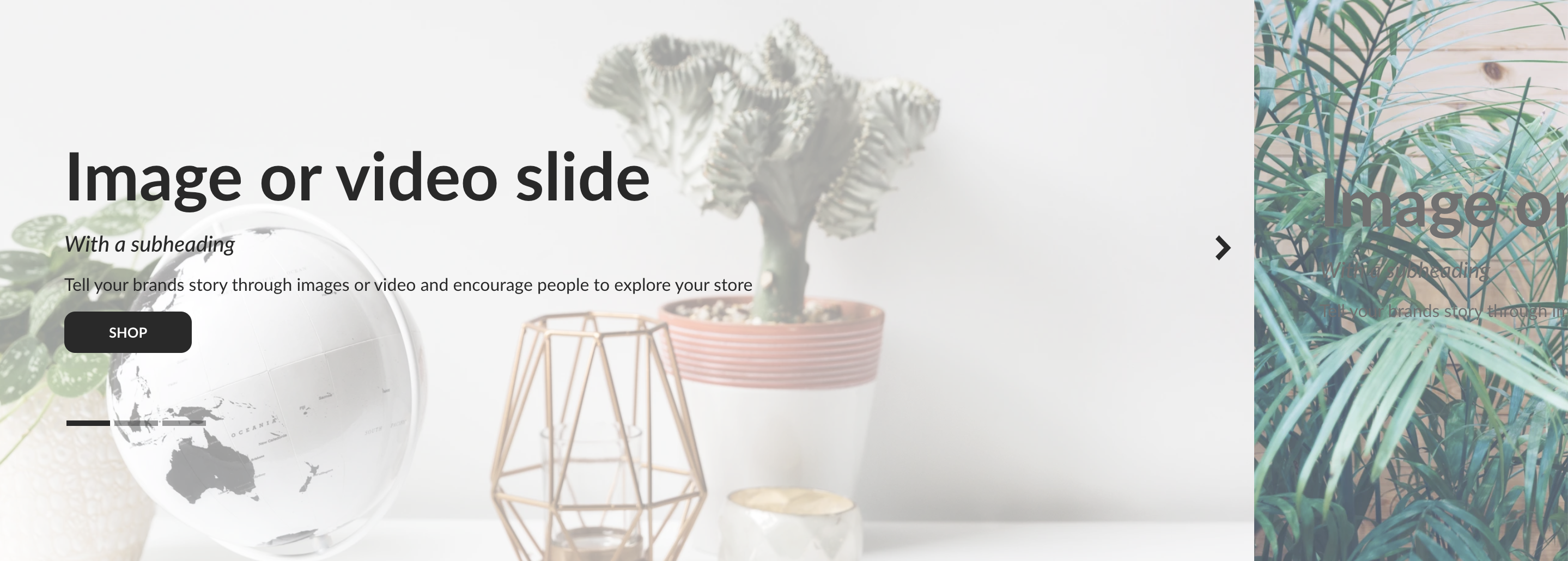
- When the slide width is less than 100%, then you will see a portion of the next slide.
- Desktop content width: Use the slider to control how wide the content is. The minimum value is 50%, and the maximum value is 95%.
-
- Full width section with 50% content width

- Full width section with 50% content width
-
- Full width section with 95% content width
- Full width section with 95% content width
- Mobile layout: Use the dropdown to select between Overlay, Text above and Text below.
- Mobile slide width: Use the slider to control how wide the slide is. The minimum value is 70%, and the maximum value is 100%.
- Mobile content width: Use the slider to control how wide the content is. The minimum value is 70%, and the maximum value is 95%.
For additional support, please submit a request and our support team will be in touch to help!